Shadow Major
Deliverer
 Current project: The Realm Wanderer
Posts: 234
|
Post by Shadow Major on Jun 17, 2011 18:29:06 GMT -5
Hi everyone. This is my character "Jinsei Sasake" that hopefully will appear in a manga that I wish to create. Please let me know any tips for improvement and please criticize me as much as you want! Attachments:
|
|
|
|
Post by Crombie on Jun 17, 2011 19:26:15 GMT -5
I'm guessing you did this digitally. What program did you use? Next, there seems to be unnecessary folds in the clothing, his eyes look a little off center, there is little to no suggestion for the trapezius muscle, theres also a lacking indication of the eyebrow's muscle, the chin needs more definition, the neck looks too stiff, and his hair is too flat, it needs to be uplifted slightly to indicat the rest of his head.
Anyway, keep trying. You'll only get where you want with a lot of practice.
|
|
Shadow Major
Deliverer
Current project: The Realm Wanderer
Posts: 234
|
Post by Shadow Major on Jun 18, 2011 2:37:44 GMT -5
Thank you for your review! Sadly, this was done on Microsoft Paint ^^" I'm sure there are better programs to use. Anyway, I've just recently started drawing manga and am looking to improve hopefully with anyone's ideas. Thanks for the encouragement!
Edit: Would you also say that his right eye is a bit too large?
|
|
Learner
Deliverer
My final Display Name. But you can still call me Hector :)
Posts: 201
|
Post by Learner on Jun 18, 2011 8:20:30 GMT -5
Oh yeah, that "criticize all you want" part, if you want to really criticize your drawings, put it in the "Art Talk."
Anyway, all the critiques was done by yajiko! I think he's the greatest critique in the world! If he keeps criticizing you, you'll get better! And also uncle dave, always criticizing.
|
|
|
|
Post by jelmobu on Jun 18, 2011 12:25:14 GMT -5
I would recommend Gimp as a photoshop substitute. Link Has a bit of a learning curve, but you will be better for using it. Layers is a wonderful thing! |
|
|
|
Post by Crombie on Jun 18, 2011 13:29:51 GMT -5
I would recommend Gimp as a photoshop substitute. Link Has a bit of a learning curve, but you will be better for using it. Layers is a wonderful thing! Yay! Thanks for recommending the program I was gonna recommend.  |
|
vortexblast
Sustainer
 If it has no purpose other than itself, it's art...
Posts: 81
|
Post by vortexblast on Jun 18, 2011 16:14:32 GMT -5
Nothing beats the real Photoshop though  GIMP is THE recommended program to start without spending any money but it has its limits. If you want a leap forward, Photoshop is the way to go but even that is not enough. |
|
Shadow Major
Deliverer
Current project: The Realm Wanderer
Posts: 234
|
Post by Shadow Major on Jun 19, 2011 0:50:36 GMT -5
Thanks a lot, guys! You reminded me that I downloaded Gimp the other day! ;D I have no idea as to how I forgot about it so quickly! ^^;
Anyway thanks for the advice and recommendations, and apologies for posting this topic originally in the wrong place...
|
|
uchihaguy
Sustainer
http://uchihaguy.deviantart.com
Posts: 64
|
Post by uchihaguy on Jun 22, 2011 20:59:31 GMT -5
Something I do wanna bring up is the character design. Their head looks great... but the clothing seems kinda bland. If you want this to be your main character, you need to make sure you have something to back up the reason why they're wearing the clothes. The era, the place your character lives in (and the weather), if they go to a school (with or without uniforms), and other things like that factor into the way the character dresses. |
|
Shadow Major
Deliverer
Current project: The Realm Wanderer
Posts: 234
|
Post by Shadow Major on Jun 24, 2011 2:02:40 GMT -5
Something I do wanna bring up is the character design. Their head looks great... but the clothing seems kinda bland. If you want this to be your main character, you need to make sure you have something to back up the reason why they're wearing the clothes. The era, the place your character lives in (and the weather), if they go to a school (with or without uniforms), and other things like that factor into the way the character dresses. Well, his white shirt was meant to be his school uniform... should it have an emblem or something? |
|
|
|
Post by qytopathic on Dec 24, 2011 21:35:03 GMT -5
REDLIIIIIINE ;D Hope you don't mind Oh, and you should try the program Paint Tool SAI. Attachments:
|
|
Shadow Major
Deliverer
Current project: The Realm Wanderer
Posts: 234
|
Post by Shadow Major on Dec 25, 2011 2:15:18 GMT -5
No, it's okay, I don't mind at all! Thank you very much for doing this. The guidelines give me a clear idea of my mistakes. I can draw better now than I did at the time I made this, but thanks a lot!
|
|
Shadow Major
Deliverer
Current project: The Realm Wanderer
Posts: 234
|
Post by Shadow Major on Jan 20, 2012 4:58:53 GMT -5
Here's an update of what my character should look like - as you can see I changed his name to "Connor Wakefield". So, if you have the time, please send in some critiques  . Edit: I have other drawings of some of my other characters, so I'll post them up for you to review. Unfortunately, they will be attachments so please forgive me for the oncoming 3 posts, or the moderator can remove them as sees fit. Thanks in advance! Attachments:
|
|
Shadow Major
Deliverer
Current project: The Realm Wanderer
Posts: 234
|
Post by Shadow Major on Feb 2, 2012 0:03:46 GMT -5
1st: Attachments:
|
|
Shadow Major
Deliverer
Current project: The Realm Wanderer
Posts: 234
|
Post by Shadow Major on Feb 2, 2012 0:05:29 GMT -5
2nd (Yes, these are just close-up pictures unfortunately *sigh*): Attachments:
|
|
Shadow Major
Deliverer
Current project: The Realm Wanderer
Posts: 234
|
Post by Shadow Major on Feb 2, 2012 0:06:56 GMT -5
And finally, 3rd. Thanks for viewing and looking forward to reading your critiques! (Yes qytopathic, your redlining would be essential for this! ) Attachments:
|
|
|
|
Post by Leelii on Feb 21, 2012 16:08:53 GMT -5
Oh my goodness you're getting so much better at drawing faces! I think you could use a little work on hair though. Try to make it look a little more "loose". In the ones uploaded here, it looks stiff and unnatural, not wavy and soft like real hair.
|
|
Shadow Major
Deliverer
Current project: The Realm Wanderer
Posts: 234
|
Post by Shadow Major on Feb 22, 2012 0:01:45 GMT -5
Yes! Thank you! And thank you for posting! |
|
|
|
Post by saitogarama on Feb 22, 2012 10:04:37 GMT -5
Beautiful!!! i really like it!!!
|
|
Shadow Major
Deliverer
Current project: The Realm Wanderer
Posts: 234
|
Post by Shadow Major on Feb 23, 2012 1:07:54 GMT -5
Thanks saitogarama |
|
|
|
Post by cn3wton on Feb 24, 2012 23:39:10 GMT -5
I can definitely see improvement. However, I do not know if this intentional or not, but the eyes seem to be a tad bit too high on the face. Other than that like someone suggested earlier the hair seems a little stiff. I had this problem as well. I found that instead of worrying about it I just drew the hair the way I felt it should go. Drawing the lines quickly can add a nice curve and shape to the hair.
I must say that the third upload is by far my favorite. Part of it is that you went with that particular style for the nose. I always prefer the minimalist approach when it comes to that.
Keep it up!
|
|
Shadow Major
Deliverer
Current project: The Realm Wanderer
Posts: 234
|
Post by Shadow Major on Feb 25, 2012 1:24:01 GMT -5
cn3wton: I'm glad you noticed the issue with the eyes. I too had an uncertain feeling about their placement on the face (especially for the 1st uploaded character), but if you can see it, then it's an unintentional mistake . I'll practice drawing hair properly from now on, and thank you for your words of encouragement . |
|
Shadow Major
Deliverer
Current project: The Realm Wanderer
Posts: 234
|
Post by Shadow Major on Mar 18, 2012 0:24:05 GMT -5
Okay, here's another picture of my character. My main focus was learning how to draw the face when facing downwards. All C&C much appreciated! Attachments:
|
|
|
|
Post by dvandom on Mar 18, 2012 16:57:44 GMT -5
Okay, the problem here is that the lower half of the face is pointed down, but the eyes are still pointed forward. Not only are they too high up, but the curves of the top and bottom are too symmetric. The upper lid should be flatter, approaching going down the other way for more extreme angles.
---Dave
|
|
|
|
Post by leucome on Mar 22, 2012 5:19:24 GMT -5
You can draw in higher resolution and scale it down after to get smooth line . Your last one look really good i think |
|
|
|
Post by leucome on Mar 22, 2012 5:54:25 GMT -5
Okay, the problem here is that the lower half of the face is pointed down, but the eyes are still pointed forward. Not only are they too high up, but the curves of the top and bottom are too symmetric. The upper lid should be flatter, approaching going down the other way for more extreme angles. ---Dave It make me think about how to draw pointed down eye .. and a good looking face viewed from the front |
|
Shadow Major
Deliverer
Current project: The Realm Wanderer
Posts: 234
|
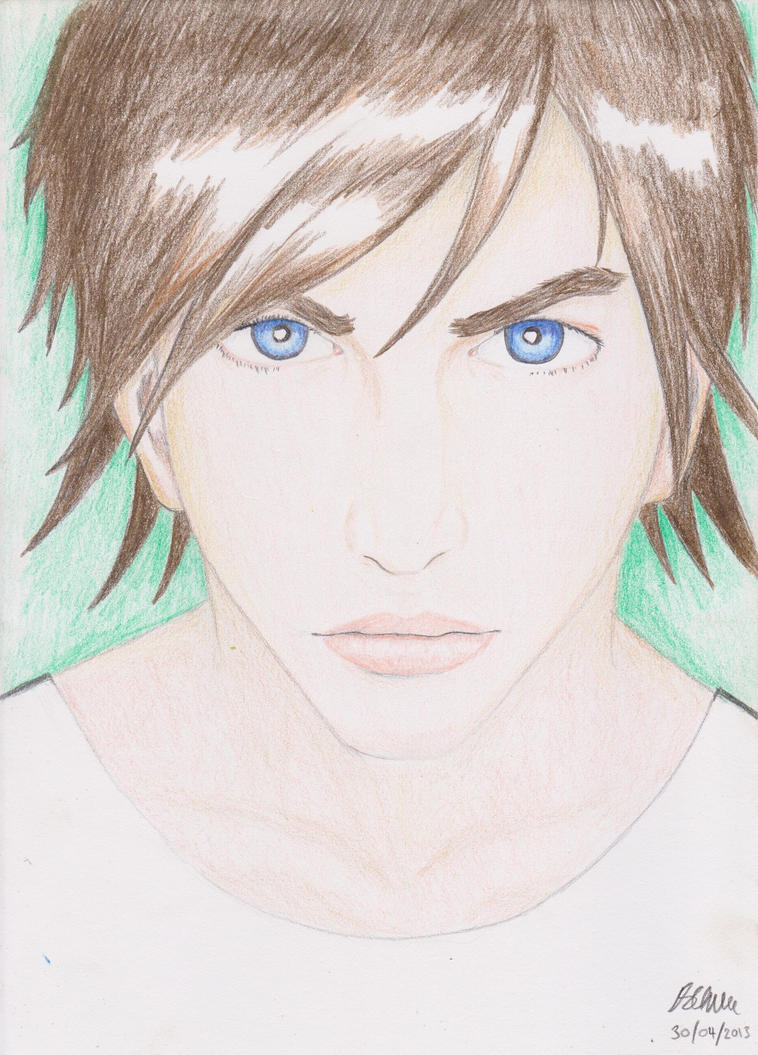
Post by Shadow Major on May 14, 2012 4:33:03 GMT -5
This may be the new design for one of my characters; what do you guys think? 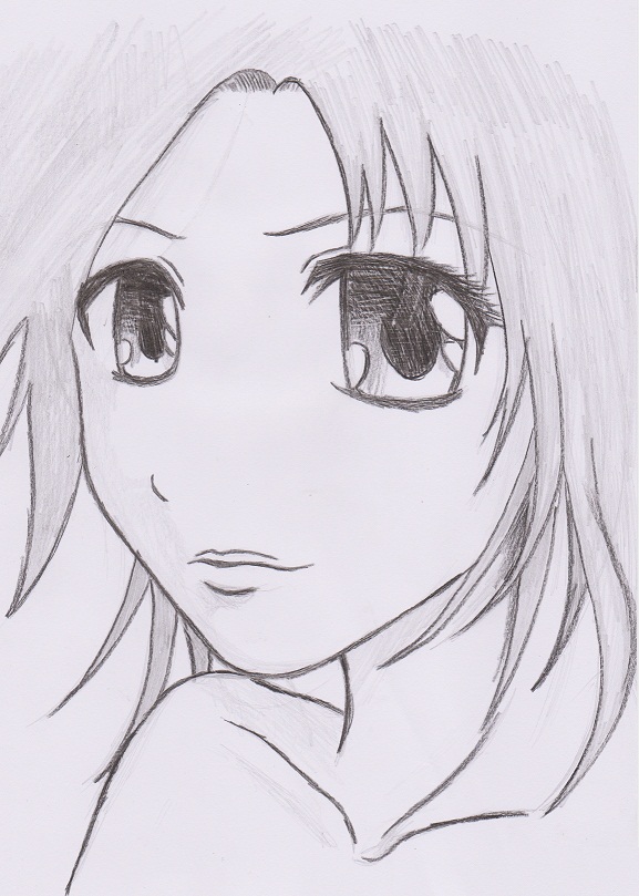 |
|
|
|
Post by leucome on May 15, 2012 0:41:46 GMT -5
She's cute |
|
Shadow Major
Deliverer
Current project: The Realm Wanderer
Posts: 234
|
Post by Shadow Major on May 15, 2012 0:47:41 GMT -5
Well, thank you ;D
|
|
|
|
Post by cn3wton on May 16, 2012 22:05:14 GMT -5
Your definitely getting better with the hair, it looks much more natural. The shoulder appears to be a little small to me, not much to say other than that.
|
|


 .
.