|
|
Post by PJCzar on Apr 10, 2009 4:51:40 GMT -5
|
|
|
|
Post by dvandom on Apr 10, 2009 7:50:11 GMT -5
Homes, short for homies or homeboys.  ---Dave |
|
thetode42
Deliverer
 The Manipulinker
Posts: 223
|
Post by thetode42 on Apr 10, 2009 10:51:44 GMT -5
It's pretty good overall, but try adding at least part of the eyes and the rest of the face. It really helps people recognize a character. I think the position the characters' in is a little unnatural. If it were me, I'd just change the way they're standing so that it's from an angle you want, but it also looks natural. The bottom of the pants looks a little strange, too. Nice work.
|
|
|
|
Post by PJCzar on May 25, 2009 1:29:11 GMT -5
|
|
|
|
Post by etheet on May 26, 2009 21:42:27 GMT -5
Try Moving the waist up a bit, same with the bewbs.
|
|
|
|
Post by PJCzar on Jun 18, 2009 23:36:14 GMT -5
|
|
|
|
Post by jelmobu on Jun 19, 2009 20:26:58 GMT -5
Cool, only thing that I saw was the nostril line kinda looks like a mustache as it's a little low.
|
|
|
|
Post by PJCzar on Jun 19, 2009 22:14:42 GMT -5
on trhe one of the girl? or the dude
|
|
|
|
Post by jelmobu on Jun 20, 2009 3:01:57 GMT -5
The girl.  |
|
|
|
Post by PJCzar on Jul 6, 2009 14:13:44 GMT -5
|
|
|
|
Post by jiraya350 on Jul 18, 2009 0:48:33 GMT -5
well, i find her legs are too "spaghetti-like" and too short for my tastes, but some people like this style, so i can't really crit on this one..
|
|
|
|
Post by PJCzar on Jul 18, 2009 22:38:13 GMT -5
yeah im working on that im getting my art more towards realism now thanks for the crit but what about my newer posts?
|
|
|
|
Post by jiraya350 on Jul 19, 2009 2:25:27 GMT -5
They're better, and realistic-er.
though if ur gonna go more realistic, i think u should work on the coloring, they look a bit too glossy, i think u should try more colors, experiment, instead of just the base color and one shade of shadow.
|
|
|
|
Post by Crombie on Jul 19, 2009 21:38:31 GMT -5
kind of reminds me of gorillaz.
|
|
|
|
Post by PJCzar on Sept 9, 2009 17:31:20 GMT -5
|
|
|
|
Post by jelmobu on Sept 9, 2009 20:42:22 GMT -5
Nice! The upper half is very well done. However, the neck is a little long (no biggie) The waist is a little on the skinny side and the torso is a bit long. The legs look a bit short compared to the rest of the body (mostly the calves). Overall, it's pretty good, just needs some minor tweaks! Visual Critique |
|
|
|
Post by PJCzar on Sept 9, 2009 20:54:29 GMT -5
ooooohh i like the way it looked when u tweeked it, Im in the photoshop phase now so i can tweek it like that thanks
|
|
|
|
Post by jelmobu on Sept 9, 2009 20:57:11 GMT -5
No problem!  |
|
|
|
Post by Caliber Mengsk on Sept 10, 2009 1:04:45 GMT -5
Yeah, biggest thing is the waist, other thing is the angle of the upper body compared to the feet. (feet facing at an angle, body facing towards us) That meaning there is no twist to the body. At least that's how it looks to me. O-o could be the boobage.
|
|
|
|
Post by satin on Sept 12, 2009 11:27:15 GMT -5
not bad, i like how u colored them. some of my criticism would be that the guys chin in the head drawing is too slanted, but that could just be my style. as for the cave i didn't really get a good sense of depth from it, I'm not sure how you would go about fixing this exactly but keep at it.
|
|
|
|
Post by PJCzar on Oct 14, 2009 18:16:54 GMT -5
NEW ART WORK. my best yet. really this time... lol
Its in blue in first post
|
|
|
|
Post by Caliber Mengsk on Oct 15, 2009 12:27:52 GMT -5
O-o just an fyi, colors don't work on links in 90% of forums. Just put a space and <- after the new ones, maybe color that part.
As far as the new image goes (first link in his first post) IMO the collar bone is too long, stretching into the shoulders a bit too far.
Also, I think that her left hand's (our right) pose looks awkward. Maybe it's just me, but it looks like that would hurt a bit. The mouth seems a little (and I mean really little) flat. O-o Don't know how to tell you to fix it, nor how to explain it further. XD
Besides that, it's a great piece that you can be proud of. All of what I said was my own personal opinion, and doesn't have to be taken to heart. The folds in the clothing are great, and the pose is good.
(and one last thing that I just noticed, is to me it seems her stomach area is a little short.)
|
|
|
|
Post by PJCzar on Oct 15, 2009 13:46:27 GMT -5
O-o just an fyi, colors don't work on links in 90% of forums. Just put a space and <- after the new ones, maybe color that part. As far as the new image goes (first link in his first post) IMO the collar bone is too long, stretching into the shoulders a bit too far. Also, I think that her left hand's (our right) pose looks awkward. Maybe it's just me, but it looks like that would hurt a bit. The mouth seems a little (and I mean really little) flat. The folds in the clothing are great, and the pose is good. (and one last thing that I just noticed, is to me it seems her stomach area is a little short.) Color of text- hmm ok if i need to but as far as i can tell what ive done so far with this forums highlight thing works from my screen. does it not work on yours? ill do what u said if not. Collar bone(s)- You mean the left or right side or both? im thinking u mean both but imma play it safe and ask. Hand- i can understand ur views on that, how ever i am to happy with what ive got to try redrawing (and prolly messing up) another hand xP Flat mouth- Yeah when i was inking i accedentally made the top lip all black so it loses its ,fullness(?), with the border. imma fix that thanks for pointing it out. Stomach- I see what you mean its an easy fix, thanks again. Folds & Pose- Thanks i've been studing kids clothes at school a hell of a lot more inorder to get them right on paper, it worked! lol the pose was completely differant in my head, Im glad it ended up like this though. I started at the head and made it up as i whent down so I got lucky ;D. |
|
|
|
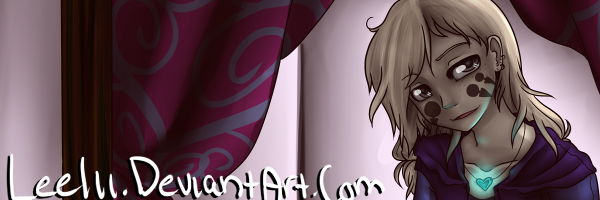
Post by Leelii on Oct 15, 2009 20:33:30 GMT -5
|
|
|
|
Post by PJCzar on Oct 15, 2009 21:18:06 GMT -5
Thanks for the comment on the outline, I had seen my friend doing it in his art and it slways seemed to, like you said, bring out the character, thought id try it and it work quite well.  Yeah the left (her right) leg is too short in my opinion, but i can see how both would seem short. I do intend to not only adjust the left leg but also elongate the legs in the computer editing process. (but not just elongate ill keep them properly proportionate) thanks |
|
|
|
Post by Caliber Mengsk on Oct 15, 2009 21:25:43 GMT -5
AH HA! You used the stupid glow effect.  I can tell now that you use exclusively Internet Explorer. That filter effect ONLY works in Internet Explorer. (it uses a direct x call believe it or not.) Just for general reference, XD Never use that. Anyone using anythinge beside IE will not see the effect. |
|
|
|
Post by PJCzar on Oct 16, 2009 14:37:56 GMT -5
Ah i understand now...
|
|
|
|
Post by Caliber Mengsk on Oct 17, 2009 3:08:18 GMT -5
( ;D I just realized there is a attachment system on these forums XD ) Hope you don't mind... I liked the image enough I've decided to color it. Gonna finish it tomorrow if I'm not too busy. Tell me what you think... or if you don't want me to. I'm guessing at the colors. Attachments:
|
|
|
|
Post by PJCzar on Oct 22, 2009 19:47:40 GMT -5
|
|
|
|
Post by Crombie on Oct 23, 2009 13:53:33 GMT -5
Pjczar i think you have preety good coloring skills ya just need more on shading.
|
|


 ) Full length animation movie 'Old Capital'. His name is Joseph Nazerith.


 I can tell now that you use exclusively Internet Explorer.