|
|
Post by cn3wton on Jun 23, 2012 21:04:36 GMT -5
THe good: I like the necklace. Good attempt at 3d, and the shading really does help me see that it is metallic.
Ok: The dress has a great 3d affect, but is far to repititous. Clothing generally doesn't fold the exact same way every time, and the straps are too "flat". I would consider revising those in some way.
So now comes the critique-iness. The neck area needs to be reworked a little bit. Some kind of indication of the collar bones could help. You need something there to give her body shape. Right now she just looks flat, meaning that it looks like her neck is on the same level as her chest, and this isn't the case.
As far as the head, it is large (i am guessing due to her age?) so her ears should be a little larger in my opinion. Also the eyes appear to be just a tad bit too far apart.
The hair is pretty natural looking near the ends, but the tops (top of the pigtails) are not as smooth as they could be. Try curving them out more. Remember that you have to let it appear natural, don't try to fit something on the page if it wont naturally drop down like that. If you want her hair to fall closer to her head, change up the hairstyle a little bit.
I can give you more specific, smaller tips, if you reply. But I am not on here much so this should give you some ideas to start. I can try to post pictures if those would help you out. I hope something helps, keep at it!
|
|
|
|
Post by dvandom on Jun 24, 2012 13:24:25 GMT -5
Well, there's not a lot of traffic in general, but at least what traffic we get is fairly signal-heavy.
On the new drawing, there's too much space at the bottom of her face. When you're drawing in that style, the facial features need to be lower in the head than on a real face. Either bring her jawline up (which might make her neck too long) or redraw the eyes-nose-mouth a bit lower.
---Dave
|
|
Shadow Major
Deliverer
 Current project: The Realm Wanderer
Posts: 234
|
Post by Shadow Major on Jun 25, 2012 0:11:14 GMT -5
There's just a minor problem with the arms that seems to draw my attention to the most. I think they may be just a tad too thick, and the part where the elbow meets is too thin for both arms. However, I'm impressed by the way you drew the hair; I find that style much better than my boring style of just flat spikes ;D Good job!
|
|
Shadow Major
Deliverer
Current project: The Realm Wanderer
Posts: 234
|
Post by Shadow Major on Jun 26, 2012 0:15:11 GMT -5
I did a quick search; didn't find much, but this www.mangalessons.com/how-to-draw-a-female-manga-body-side-view. Not saying you have to do this, but this is just me. If ever I want to find out about something, I do not rely on tutorials, I simply try to figure things out myself with photo reference, real life, etc. It really helps most of the time  |
|
|
|
Post by cn3wton on Jun 26, 2012 17:28:34 GMT -5
Alright I will give you the same advice I gave Shadow Major. The best hair comes by creating them using quick strokes. Meaning that you should draw them fast (think flick of the wrist fast). The biggest thing an artist needs to learn, is to not just draw things from sight, but to also learn why you are drawing what you are drawing. For instance with hair, dont just draw bangs to draw bangs. You have to say, "ok this character is going to have this kind of haircut, how would the hair naturally fall across the face? Is the head tilted to one side? Is the wind blowing? How is the hair resting on the head?" All of these questions will help you know why you are drawing hair the way it is, instead of just copying it. It will come with practice, and is still something I struggle with. But learning how it acts/falls/lays/etc will help you create hairstyles from memory without reference. As far as the ears, I don't know if I necessarily agree with smaller ears for younger kids, but its really up to you and the style you like. But I would suggest placing the ears lower on the face, starting below the eye. Your character reminds me somewhat of Mina from Dance in the Vampire Bund. Here is an adequate reference photo that may provide you with some inspiration 1.bp.blogspot.com/_Zg1R9ioNR1s/S8LPeyFlJKI/AAAAAAAAI3Q/LWBY8ulnHOU/s1600/minablogfinal.jpg. I would just like to warn you that the show can have some themes that some adults may not find appropriate for children, so just be careful. (I don't know how old you are but just an FYI) It is important that when you use reference you don't just copy it, but learn from it and adapt it. As far as changing a drawing after it is "done", there are tons of ways you can change something. The more expensive route I use is something called a lightbox. This will shine light up through your drawing and will allow you to recreate it on paper above the finished drawing. I do this when creating inked versions of my drawings. Another step is to find a red/blue colored pencil (I use an erasable red correction pencil that I found in staples.) You can do this over your drawing and fix what you need to. If you are not happy with a drawing whats stopping you from correcting it this way? I generally start sketching in the base body features with the red correction pencil. I wish I had seen this post before I removed all of my old work on my deviant art. I had a really great drawing that shows the process I used with the red pencil to take an average piece of work and really make it 100 times better. I would be interested to know your current level of experience with drawing, and how interested you are in getting better. If you want to go all out with your drawing I suggest doing some work with anatomy. This will allow you to create poses from scratch with little to no reference. If you are just doing it casually, using reference may be a quicker means of improving your poses and proportions. If you do plan on improving and getting more help, I suggest creating a deviantArt account. I currently have no deviations up because I wanted to start fresh so I deleted all of them, but hopefully I will get something up soon. I really want to do something big for my return though, and I am having trouble deciding. But feel free to check it out/follow me on there and I can check out your stuff from time to time. |
|
|
|
Post by cn3wton on Jun 28, 2012 13:01:57 GMT -5
Ok I guess its kind of hard to explain certain things in words. I should be uploading an image tonight or tomorrow for an initial sketch of what I am working on now. You will see what I do with the red pencil. I may print of your picture and try to help you out with some reference lines and such. If you don't mind.
When I say flick of the wrist fast, I don't necessarily mean flick your wrist. But move fast. They don't need to be perfectly even width lines. Its the imperfections in the thickness of the lines that can add too it. You may find using a sharpie to be easier than pencil. I really like the 2 tipped sharpies that have a fine and medium point on each end. I use it for quick sketches/concept sheets that I do.
As far as the realistic drawing, I sure hope your a lefty... Or else your going to have to be super careful to avoid smudges. Are you using a photo reference? Its pretty good so far, I can also tell you are taking quite some time with drawing it. Keep guidelines and reference points in mind when continuing, and don't rush. Scans generally look different than the actual drawing, (generally worse imo) but this one looks pretty good. Just keep at it with a steady pace and you should be fine. The biggest thing I can say about pencil shading is to remember that the eraser can be a drawing tool as well, not just a correction tool.
Its hard to give you critiques on a drawing like this with no guidelines. While there is nothing wrong with not using guidelines, I can't say something like "Oh the eyes are too high on the head, or the forehead is too small, etc" Because I can't see where you intend to place them.
I will get to work on the guidelines/corrections for your drawing and find a way to upload it here for you too see.
|
|
|
|
Post by cn3wton on Jun 28, 2012 15:03:58 GMT -5
Here it is. I apologize for its poor appearance. I did this while riding around in the car. But I really wanted to get it done. So while there are some parts that aren't that great, it will help give you the idea of some things you should work on. I do not draw children often, so it was quite a learning experience for me as well. I did some guidelines with the red pencil to show you what I meant. But most of it was done with just the 2 tipped sharpie I carry around with me. So basically once I drew a line I was stuck with it since it was permanent... Now I kept my "drawing" to the scale you created in yours. I tried to leave some of the old image in so you could compare. But of course you have it with you so I didn't bother doing that all that much.  Ok first I hope you can see the red pencil. You should be able to see how I worked things out such as the length of the arms, the position etc. The big things you should notice is that I changed the position of her body. Straight on shots just do not look natural, and I just couldn't bring myself to do it. Even this pose isn't 100% natural as I was trying to use it to show you different things... I figured that if i put the right arm out in front it could show you more than drawing the awkward front on view. So this leads the arm to not rest as naturally on the body as I would have liked... but I hope you get the point. Also I was going to change the view of the head (to a 3/4 view) but I figured I would try to keep it straight on since I see you've drawn them quite often. So instead of showing you a new view, I would reccommend fixes for the one you prefer now. First off if you have any questions about a specific body part, I can upload a more detailed analysis of just that part. Alot of the stuff I will say here is also written on the drawing, but my handwriting is awful. Lets start at the top and work our way down. HEAD****I would like to point out the shape of the bottom of the face. I do not believe in each side being symmetrical. I just don't find it to look right. So even in front view they are slightly different. If you look at the chin it actually curves up then out again (slightly) on the right side. I personally think this looks better than each side being identical.*** HairI widened the hair at the top of the head and made it evenly round on both sides. Your were chopping her skull off just a little bit, and this increase in size makes it more accurate. As far as the pigtails go, I tried my best to show you what I was trying to say. I hate them, and rarely draw them without reference, so I suggest looking those up. But I hope you can see what I mean by having them fall farther away from the head. I also added the loose hair below her head as a more personal preference. Face I increased the size of the eyes and the ears. I feel they make it look more child like. I also want to point out the shape of the eyes. I find this shape to be more youthful, and the eyelashes can be a nice touch. I changed the mouth just to give her a little more emotion. The ears and eyes could be even lower for a younger person. And they eyes could tilt down at the sides as well. THE BODY****I focused most of my time of the upper torso and arms. The lower parts I kind of just threw in. To be honest I was trying to draw in guidelines with the red pencil, but the original drawing kept throwing me off! I was also trying to keep the head in the same position/perspective. The body itself should have more of a curve to it. It seems a tad bit off balance. sorry  **** NeckOn adults the neck is generally 1/4th the height of the head. But it is usually smaller when they are younger. I like the expirement with the width of the neck until it looks right. So I can't really tell you a definite guideline for that. The neck does not end at the shoulders. It in fact goes into the body and its total length is measured by including the part that enters the chest. There are muscles on the back that connect to the neck that make the shoulders actually slope downwards to the collar bones. (check it out in a mirror). They are less pronounced for girls/women. Chest/Torso/HipsWhile young girls aren't curvy like their older counterparts, they do still have the same muscle definition (of course there is less definition due to baby fat etc). So I suggest taking a look at what I did here with the shape of the dress (notice its like skin tight to show off the defintion). I was going to do this whole thing in just red pencil to show of the shape of the muscles and such. But it did not really show up well over your image. If you want a image that helps show the muscles and stuff, I can do that for you seperatley. *Also the most important thing here is the width of the shoulders and hips. Realistically the younger the girl is the more even they are, and as they age the width of the hips begins to increase and become greater than that of the shoulders. This is due to the fact that well, they have babies and need wide hips. ArmsOk the arms were the biggest thing here. I tried to draw a "finished" arm, and a "guideline" arm. The finished arm is the one out front. As you can see the arm is not a continous arc. The deltoid muscle is located at the top of the upper arm. While it is smaller on women/girls, it is still there and you need to account for this shape somehow. It is a little pronounced here just so you can see it. Then take note of the shape of the upper arm. It bulges out slightly then comes back in. However they are not mirror images of eachother. Notice how the upper arm overlaps the lower arm. This shows us that the upper arm is farther ahead in space than the lower. If the lower arm was closer to the viewer, it would overlap the upper. The lower arm isn't shaped just the way I would like it, but it gives you the general idea. It is wider near the elbow, then shrinks back down as it continues down. It then gets slightly wider at the wrist. So that takes care of the shape. The guideline arm is the one on the right side in red. See the arcs extending from the body? These arcs show where the elbow and wrist should be placed if the arm was extended straight out from the body (no foreshortening). And once again you can see the the shapes. The elbow area is located somewhere between the diaghram (bottom of ribcage) and the belly button. Now I believe realistically it lies closer to the belly button, but you can change it up slightly without hesitation. Now the end of the wrist is at the end of the well...crotch? To be 100% scientific it lies at the bottom of the pubic arch. I think you get the idea. ****The hardest thing for me to learn was how the arms actually connect to the body. I suggest looking at the area around the armpit very closely. Learn how this whole area works. The arms do not just pop onto the side of the body, and they do not just hang there. Hands Sadly I ran out of room to do more with the hands. They should be larger. I would say experiment with there length to be 1/2 to 3/4 the length of the head. Of course the longer they are the older the person is. I think the hand I "drew" is about 1/2. Of course it lied right on where you had drawn the skirt, so I wasn't able to detail it over my white poster marker. So I apologize for not drawing the hand well. I hope this shows you what you can look at next. I suggest breaking it up into parts. For instance work on specific sections one at a time. DO NOT ATTEMPT TO FIX IT ALL AT ONCE. You want to remember it after all. I hope this helps you, and that you don't take offense to me altering your work. |
|
|
|
Post by cn3wton on Jun 28, 2012 15:10:05 GMT -5
This reply is for the realistic drawing. So what your saying is that you are placing the sheet of paper over the original image? Basically tracing the image and then shading it?
Just a note, I modified my last post quite a bit. I don't know when you will read it. But I won't be changing anything after this post.
|
|
|
|
Post by cn3wton on Jun 28, 2012 16:05:19 GMT -5
While what you are doing is like you say, similar to tracing, it is a great way to learn how to shade and represent color images and gradients with pencil. I would try to work away from that though. As you wont be able to take a raster of someones face if you want to draw from life!
I am glad you like the "re-draw". But your part about not adding emotion because you jsut wanted to get how the character "looked" for shame! A characters mood says just as much about it as its appearance. It can affect hairstyle/clothing/etc. But I understand what your saying about wanting to get it done.
If you want any more help feel free to ask. Like I said this helped me out a bit as well. While your style is a little more cartoony then mine (and I tried to draw it as close to yours as possible) the more I get to draw the better. Feel free to ask for my help anytime. I am no expert, but I will do what I can.
|
|
|
|
Post by cn3wton on Jun 30, 2012 21:53:45 GMT -5
I did not mean to say that what your doing isn't art. So I hope I didn't offend there. I look forward to seeing it completed.
|
|
|
|
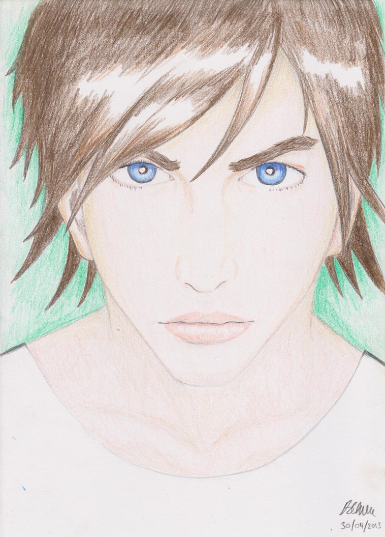
Post by cn3wton on Jul 1, 2012 9:00:39 GMT -5
This is not a suggested technique so maybe I shouldn't suggest it to you... but if you have problems drawing things on the left hand of the drawing (all righty's do at times/at first). Just flip the paper upside down. This will place the eye on the right side. It may sound wierd but this can actually create better drawings. There is a book called drawing on the right side of the brain. And it shows that people who re-draw images generally draw them better (when they are learning) when they are upside down. This is because you are drawing shapes and lines, not objects you recognize. It is kind of hard to explain here but try it out it may help.
As far as the image its looking good, not much I can say aout it. You have shading down pretty well and would like to see you try to draw something original when you finish this. There is just something about the left (our left her right) eye that is a little off. I think it is slightly larger than the other? Or the shading on the lower lid isn't like the other. While in no way should they be mirror images of eachother, there is just some minor thing about it that I just can't put my finger on... Regardless its looking pretty good and I can't wait to see it done.
|
|
|
|
Post by cn3wton on Jul 1, 2012 10:46:56 GMT -5
Its the pupil in the eye. Thats whats throwing it off. Its not big/round enough. The hairs looking good so far.
|
|
Shadow Major
Deliverer
Current project: The Realm Wanderer
Posts: 234
|
Post by Shadow Major on Jul 1, 2012 17:38:20 GMT -5
Wow that's beautiful ;D. The only problem I could see with her right eye (our left of course) is that there is more space from the corner of her eye to the iris. Otherwise, this is very good for a realistic drawing  |
|
Shadow Major
Deliverer
Current project: The Realm Wanderer
Posts: 234
|
Post by Shadow Major on Jul 1, 2012 22:05:51 GMT -5
My apologies. What I meant was, there's quite a considerable amount of, well, the white part of the eye from (our view) the left corner of the left eye to the left side of her iris. I guess what I mean is there is a lot more compared to her other eye. That is all ;D
|
|
Shadow Major
Deliverer
Current project: The Realm Wanderer
Posts: 234
|
Post by Shadow Major on Jul 2, 2012 6:01:37 GMT -5
I thought it was Lady Gaga!  When I first looked at it, I was like, "Wow, that kinda looks like Lady Gaga" |
|


 ****
****
 When I first looked at it, I was like, "Wow, that kinda looks like Lady Gaga"