|
|
Post by cn3wton on Jun 30, 2012 21:50:44 GMT -5
So I have been working on fundamental stuff like anatomy and such for weeks now. And I haven't really drawn anything that I planned on coloring. So I finally sat down yesterday and drew out a rough concept page. Today I sat down with a blank slate and redrew it with more complex perspective/foreshortening/etc. I don't plan to upload this to my deviant art until it is done, but I thought that maybe I would post the progress here and get some comments? This first image is an absolutely awful scan, but at least you can see it. The poor quality is due to the fact that the paper is larger than the scan area. For instance the leg that seems to just end, actually has a foot attached to it... This causes the whole thing to be slightly skewed. Notice how the circles all seem to be ovals? Yea thats how badly messed up it is... So please keep this in mind! And I promise I will trim the paper down for the next one. Also I would just like to say that this concept sketch is solely for pose and positioning. I intend to have the characters wearing clothes, but I want to get the pose down before I do that. Considering my clothing drawing skills are lacking. I have also lightly sketched in her wings. I want to get people feedback on the size and positioning of them. I feel that they are too awkward in their current postion. And was thinking they need to be pulled back and away from her body (sort of encircling here and drawing the eye back to her/him). Any comments are much appreciated!  |
|
|
|
Post by dvandom on Jul 1, 2012 1:41:55 GMT -5
Ah, the quest for a scanner as big as typical drawing paper. It has frustrated many.
I'd suggest having the wings curled more around to the front, since her arms already appear to be hugging tightly across her chest and that would tend to reflexively draw the wings around as well.
---Dave
|
|
|
|
Post by fdmfdm on Jul 1, 2012 6:04:35 GMT -5
i agree with vandom, having the wings curled a bit would look great  and personally i prefer drawing on a4, because most scanners can scan that, the problem is that i use ordinary printpaper, making it easy to get damaged  also is that a tail comming up ib the lower right and going aroung her lag? , i find the end of it to look a bit strange (but could be the scannerproblem) i do seriously like the hair of the girl |
|
|
|
Post by cn3wton on Jul 1, 2012 8:51:44 GMT -5
Yea I usually sketch concept sheets on normal size card stock. However I am also trying to go through some old drawing pads I have. This is in fact the last one I have left (the sheets are all falling out) so I am working on that. I prefer card stock over printer paper because it is thicker and I think it works pretty well as a substitute.
As I said the wings are kind of placeholders, I appreciate the insight however dave. I did not think about having them curve around her body. I really like that idea and will definitely try it. Her arms are close to her chest. Originally I was going to have her hand/arm outsretched and placed on his chest, however it just looked so awkward. After experimenting for awhile with the pose in real life, I realized how unrealistic it looked when trying to do that. But I did place her hand on his shoulder area (you can see 1-2 fingers). Does this look like it is positioned correctly?
As far as the tail it is a tail. The ending is supposed to look kind of like a venus fly trap with teeth, looking away backwards kind of towards the vanishing point. Its kind of hard to see the detail with all the extra lines, but I will try to make that more apparent when I redraw it.
Thanks again for the comments, if there is anything else about it that you noticed please let me know. I a going to trim of a little bit on the left side. So you will actually get to see the whole picture and not one with an amputated foot. I will fix the wings and some other minor details and repost this before moving on to the final.
Oh and fdmfdm, thank you for the compliment on the hair, but its really kind of a placeholder I drew in. I haven't really spent any time on any features like that. Even their faces were quick things I drew in with little thought. I guess all the practice I have done drawing them has payed off a bit.
|
|
|
|
Post by cn3wton on Jul 7, 2012 16:09:15 GMT -5
I hate to double post, but I just wanted to give you all an update. I have drawn up some sketches for accessories and such for the drawing. I am doing some studies for clothing and stuff right now. I want it to be fantasy/medieval stuff, so I am trying to find something to fit that...
I have got to get going on this and finish it... The problem is that I have put so much pressure on myself for this. I want this to be the "breakout" peice on my deviantArt. It will be the first once since I deleted all my old deviations, and I want it to be really special. But I feel that I am wasting too much time. I know all I have up right now is the concept sketch, but I want you guys to be extremely critical. Anything that bugs you about this please let me know, you will not hurt my feelings. Especially porportion and pose.
The only thing I don't need to know? I realize that he has an extra finger on his left hand, but I will fix that.
I will try to get something done to post here tonight... even if its just another concept page...
|
|
|
|
Post by fdmfdm on Jul 7, 2012 18:31:09 GMT -5
XD sorry but i just lolled at the extra finger part  but fantasy/medieval is extremely hard so the best advice i can give before i see the drawing is watch the details, they make it pop out as medieval and fantasy |
|
|
|
Post by cn3wton on Jul 10, 2012 19:52:41 GMT -5
Here is the newest redraw. I did a test ink and color, but I have finally decided that I am going to just pencil in this and be done with this. I can't keep holding myself back by trying to get this perfect. I am not yet at the level I want to be, and redrawing the same image over and over again isn't the best use of my time. So here it is, I will upload the completed pencil as soon as I finish it. And I will upload that to my deviantArt as well.  I went up to my familys camp and decided to do some sketching, and I had this idea:  This will not be my next drawing I dont think. I have an idea for a pin-up for my cousin who is in the military. Hand drawn pinups were widly used by troops some time ago, so I think it would be fitting. Considering I have no money to send him something else. But as far as the second image, the redraw will focus more on composition. It will not be full body, most likely it will stop just below the knee. That would lead it to be larger and I really want to emphasize the foreshortening on the whip. As far as my deviantArt is concerned, I will be updating it with that first pencil, and will continue uploading pencils. I was originally going to upload finished works... but I just am not good enough for that yet. It takes me so long to do that, and I feel my time is better spent working on bettering my skills. Most likely any large works will stop at inking (mostly backgrounds). I need to save the ink in my copics. I hope you all have some comments for me. If you want to keep checking out my work I will be uploading them to my deviantArt after this as well. So you can follow/check me out there too. |
|
|
|
Post by cn3wton on Jul 11, 2012 14:53:52 GMT -5
|
|
|
|
Post by fdmfdm on Jul 13, 2012 15:50:34 GMT -5
i like the clothing, the bodies and the clothes but the faces of both the girl up here and the guy on deviantart seem a bit strange to me, for the girl its the mouth that seems strange to me, perhaps a bit to low because of the lack of nose? and for the guy, both the mouth and the nose i think a round nose with no bridge like that wont fit well i think, i think giving a bit more pointish and a bridge would look nicer, (with bridge i mean the entire bridge not just a small part, it does not show up well as it is) and again i feel like the mouth is a bit low, but that can be just me but if its not this its something else that makes it a bit off but i love the overall perfect simplicity of the drawing, no overdoing it, and still make every shape and curve nice and visable |
|
|
|
Post by cn3wton on Jul 13, 2012 19:50:47 GMT -5
Yes the mans face annoys me. I drew a concept on a seperate sheet of paper that I liked more. But I had redrawn the face so many times that I was afraid that redoing it again would ruin the paper. As far as the mouth being low, thats a stylistic choice I am trying out. I like to try to include as little detail as possible on the face as possible. However I am having a hard time applying this to male characters.
I am working on a project for my cousin now, its a little more NSFW than my usual stuff, so I won't be uploading that here.
As far as the mouth, I am going to wait to see how it looks once I draw it larger. Generally the mouth is drawn lower to over emphasize an emotion (generally dissapointment). Which is one of the cool things I like about manga inspired styles. I was going to see what it did in this situation, but its kind of hard to tell in such a small scale.
|
|
Shadow Major
Deliverer
 Current project: The Realm Wanderer
Posts: 234
|
Post by Shadow Major on Jul 13, 2012 23:50:21 GMT -5
At least you can draw bodies very well ;D That is a skill I am hungering for at the moment XP
|
|
|
|
Post by cn3wton on Jul 14, 2012 10:52:51 GMT -5
Ha yea, thats how it always is. I get to a point where I am happy with one thing, and the other falls behind. I used to be happy with how I drew faces... oh well now I know something I have to keep working on!
|
|
|
|
Post by dvandom on Jul 14, 2012 10:53:30 GMT -5
The guy's mouth is too far down. Move it up so that it's at least halfway betwen nose and chin, and that'll help a lot.
---Dave
|
|
|
|
Post by cn3wton on Jul 14, 2012 11:22:21 GMT -5
Yea... I dont know what I was thinking with that...
|
|
Shadow Major
Deliverer
Current project: The Realm Wanderer
Posts: 234
|
Post by Shadow Major on Jul 14, 2012 20:43:12 GMT -5
I tried moving the guy's mouth up a bit (hope you don't mind ;D) - what do you think? EDIT: THIS PIECE BELONGS TO CN3WTON. IT IS HIS ORIGINAL ARTWORK AND ALL CREDIT GOES TO HIM. ;D Attachments:
|
|
|
|
Post by cn3wton on Jul 14, 2012 21:16:41 GMT -5
How dare you! Just kidding, I prefer the mouth of the finished one I uploaded to my deviantArt, but I do agree that it looks better moved up.
And I don't mind you doing that, in fact I put right on my page that if anyone wants to trying finishing any of the concepts I post I would love to see them. Just as long as they give me credit for the lines and send me a link so i can check it out!
|
|
|
|
Post by fdmfdm on Jul 15, 2012 6:47:49 GMT -5
something else i notice btw is that he seems almost angry with those eyes/eyebrows,
why did you put them so curved and low,
(or is that just me? XD)
|
|
Shadow Major
Deliverer
Current project: The Realm Wanderer
Posts: 234
|
Post by Shadow Major on Jul 15, 2012 19:05:01 GMT -5
How dare you! Just kidding, I prefer the mouth of the finished one I uploaded to my deviantArt, but I do agree that it looks better moved up. And I don't mind you doing that, in fact I put right on my page that if anyone wants to trying finishing any of the concepts I post I would love to see them. Just as long as they give me credit for the lines and send me a link so i can check it out! Wow, I just looked at the finished one on your DeviantArt, and I agree with what you say! ^^ You're right, I should have given more credit up there... I'll edit the post  |
|
|
|
Post by cn3wton on Jul 15, 2012 21:08:35 GMT -5
HAHA I didn't mean you had to say that on the post where you moved the mouth! I was saying that I don't care what you do with it, just if they do something like color it that they just give me credit for the idea (and send me a link so I can see it!). But moving the mouth and giving advice here doesn't need the "owned by cn3wton thing". You don't need to give me credit in the post, because its not like your posting it saying "look what I drew!", your original post was fine.
I am sorry for the confusion.
And about the eyebrows... I kind of just drew those in... His expression is not really exageratted, and I was going for somewhat realistic proportions so they should lie somewhat closer to the eyes. But I agree that they dont look quite right... I think that I am gonna work in some more work on faces, specifically emotions and such.
|
|
Shadow Major
Deliverer
Current project: The Realm Wanderer
Posts: 234
|
Post by Shadow Major on Jul 16, 2012 1:33:08 GMT -5
Lol, it's funny cn3wton, you say I am good at doing faces, but my skills at drawing bodies need a bit more improving. Here, I think you are great at drawing bodies, yet you say you need to work on faces!  Coincidence? |
|
|
|
Post by cn3wton on Jul 16, 2012 9:25:38 GMT -5
Perhaps! I really think what it is is based on how much time spent working on it. I feel like you have drawn quite a few pictures with faces recently, while I haven't drawn just the face in like 1-2 months.
Whenever I draw bodies too, I tend to not focus on the face much and make it an afterthought kind of thing. Which is really bad practice...
|
|
|
|
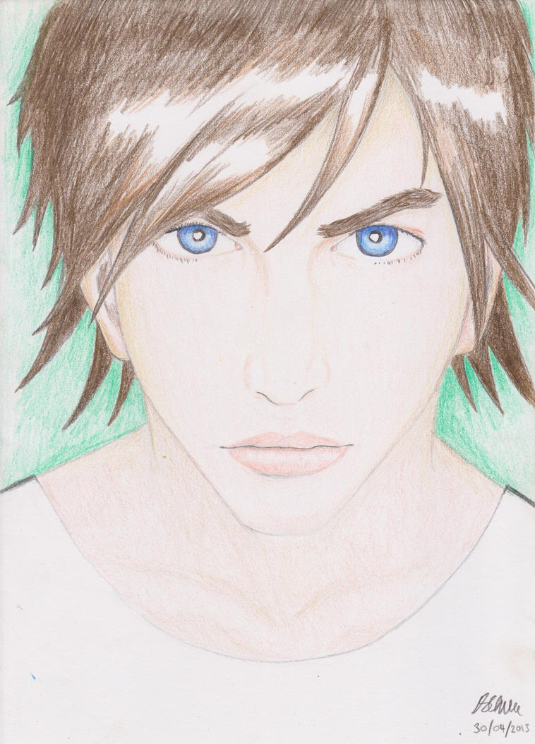
Post by cn3wton on Jul 16, 2012 21:55:37 GMT -5
So I drew up a quick face in the style I have been working on. Critiques are welcome! Just a few things though! I realize that she has no nose, this is a choice I made intentionally. And I drew in the shoulders and stuff as an afterthought, so I odnt expect them to be perfect. The goal/point of my style is to create a somewhat cartoony, yet somewhat realistic style. I like how the female faces end up, I guess I should try out some male ones. I was also considering inking and coloring this, but who knows...  |
|
|
|
Post by dvandom on Jul 16, 2012 23:44:40 GMT -5
Hm. The rest of the face is too "normal" to support the noseless look. A faint shadow triangle at least seems called for.
---Dave
|
|
Shadow Major
Deliverer
Current project: The Realm Wanderer
Posts: 234
|
Post by Shadow Major on Jul 17, 2012 1:55:19 GMT -5
Hmm... not bad! The one thing that puts me off is how her right jaw line has a smoother curve than the left, but I think somewhere you said that was your own style, so I won't go too much about that ;D I like how you managed to replicate her eyes on both sides quite perfectly; that's a challenge that most artists face, and it looks like you did it good here, nice job! Edit: Oh yeah, and are you considering putting a nose on? |
|
|
|
Post by cn3wton on Jul 17, 2012 8:31:32 GMT -5
Yea Im going to put some kind of indication of the nose in. I hate noses, not because I can't draw them, I just don't like them. But I agree something needs to be there. Also her hair is a little to flat for my tastes...
Ill keep expirementing with it.
|
|
|
|
Post by cn3wton on Jul 18, 2012 22:28:55 GMT -5
So here is a concept I did quick... The finished one is located on my deviantart (somewhat nsfw) cn3wton.deviantart.com/art/elf-color-1-315588545This is the first of many more "pin up" style like drawings. This one is kind of bland... I don't know what I will work on next... I look forward to your comments. Attachments:
|
|
|
|
Post by cn3wton on Jul 19, 2012 18:57:35 GMT -5
I think Ive decided on the pose for my cousins gift. I hope to have it done tonight so I can mail it out. I just have to decide on a background... I may just go with a shadow... Its slightly nsfw. Check my deviantArt for the final version! EDIT: Its finished for you all to check out here cn3wton.deviantart.com/art/rwb-pinup-nobg-315783627Attachments:
|
|


 Coincidence?
