vortexblast
Sustainer
 If it has no purpose other than itself, it's art...
Posts: 81
|
Post by vortexblast on Jul 4, 2012 13:15:58 GMT -5
I've been away for a while but I did do something. First of all, I did colour 2 of my drawings: The first one is a one year old drawing that I just finished colouring it yesterday. It's called Red Darkness.  Second one is one of my best works coloured. You can see the original drawing in another thread that I made.  Now this one is brand spanking new, I finished drawing it and it's going to the colouring process. It's called Zmyeya  So what do you think? What are your critiques, mainly the third and last drawing? |
|
|
|
Post by fdmfdm on Jul 4, 2012 15:09:44 GMT -5
personally i like the 2nd and 3th the most, the face on the first seems a bit strange to me, probably to flat because no shadow? the 2nd has some shadow(could be more) but seems nice to me. i actually reallty like the 3th (not looking at the surrounding, i take it you dod not really focus on that XD) but to me it seems like the left sleef the lower part that should go forward seems to be behind the hand (as shown in picture below) not sure how to fix this as im not good in drawing yet XD, but im sure someone else will know. (at least this is what i see)  |
|
|
|
Post by dvandom on Jul 4, 2012 17:13:29 GMT -5
The impractical weapon on the first one would be stabbing into his left arm, I think. The foreshortening is tricky, especially for a totally fantasy object with no established length, but it does look like it should be occupying some of the same space as his arm.
---Dave
|
|
vortexblast
Sustainer
If it has no purpose other than itself, it's art...
Posts: 81
|
Post by vortexblast on Jul 5, 2012 4:50:26 GMT -5
Thanks for your inputs.
The first drawing is actually made a year ago, I just coloured it a few days ago so I did improve a lot in a year. It was one of my best until it was bested by number two which I did the drawings a few months ago but finished colouring it this month.
The last one is recent and I deliberately hide a bit of her hand. The sleeve is actually in front and hiding a portion of her right hand. It's in the colouring stage as of right now.
Regarding the perspective of the third drawing, I made it a bit exaggerated like it was shot with a wide angle lens so the land is a bit curved.
|
|
vortexblast
Sustainer
If it has no purpose other than itself, it's art...
Posts: 81
|
Post by vortexblast on Jul 5, 2012 9:27:28 GMT -5
This is the coloured version of my recent drawing. I just finished it today.  What do you think? |
|
|
|
Post by dvandom on Jul 5, 2012 16:55:34 GMT -5
Small point, but it does seem to come up a lot across artists and decades...when drawing weapons that are sheathed, make sure that they could actually be held and used as weapons. Those daggers strapped to her thigh have handles about two fingers wide (and they're curved, so they can't be fingertip-held throwing irons).
---Dave
|
|
vortexblast
Sustainer
If it has no purpose other than itself, it's art...
Posts: 81
|
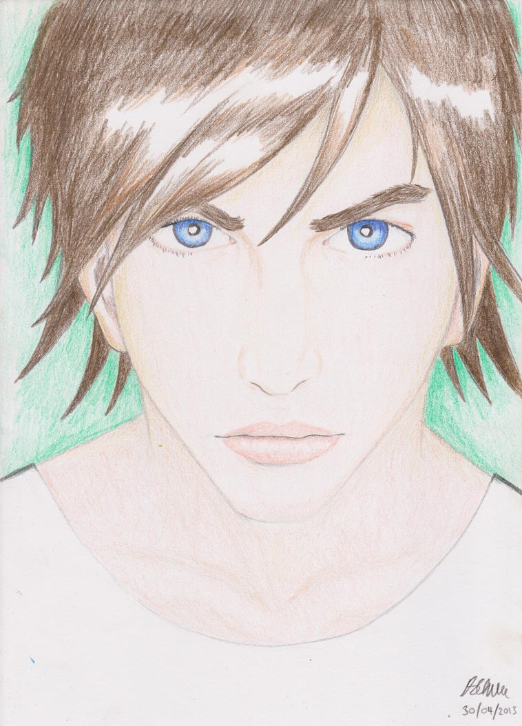
Post by vortexblast on Jul 6, 2012 18:58:37 GMT -5
Ok, now I might be showing off but I've shown this brand spanking new piece that I've finished drawing and colouring it a few hours ago to some people, they said it was great but something was bugging them off, it's the face but they can't put their finger on what exact part of the face. Now, this is already finished, I won't make further adjustments but it'll be nice to know what's bugging them off (and me too, a bit).  |
|
Shadow Major
Deliverer
 Current project: The Realm Wanderer
Posts: 234
|
Post by Shadow Major on Jul 6, 2012 19:35:59 GMT -5
I think that her eye in proportion to the rest of her head is too large, or perhaps her head is just too small. For example, it seems to me her chin is too short; maybe lengthen it a bit?
Overall, beautiful colouring ;D
|
|
|
|
Post by fdmfdm on Jul 7, 2012 3:05:08 GMT -5
it might also be that it looks a bit flat. its hard to make a face look nice and roundish i think the best way to do that is with shadows, but im not someone who colors in  but i do love the rest of the coloring  |
|
|
|
Post by cn3wton on Jul 7, 2012 16:00:52 GMT -5
The biggest problem with your last coloring is the neck. The neck does not attach like that. Look at this reference photo us.cdn2.123rf.com/168nwm/lvnel/lvnel1102/lvnel110200046/8867536-beautiful-woman-with-long-black-hair-in-ponytail-and-shiny-skin-looking-up-in-profile-natural-make-u.jpgYou can see what needs adjusted there. The jaw line doesn't drop down like that either. Even though she is looking up, the chin/jaw area stays within the same relation. Meaning the jaw stays atached to the skull when looking up. In this the jaw seems to stay in position, while the rest of the head stretches away. Human jaws do not (well, should not) do this. The easiest place to keep as a reference point is the ear. Or in this case, the headphone. The area where the jaw bone curves up should be much closer to the ear. In fact, most of it should be covered by the headphones. I suggest taking a look at the reference photo and making those adjustments on a copy of your drawing with something for future reference. You don't have to redo the drawing, just make a "fixed" version. That way you will know what to do next time and can use it as reference. |
|
|
|
Post by fdmfdm on Jul 7, 2012 18:32:48 GMT -5
and thats why i like your advice cn3wton, i did not see it but now you say it, it is so obvious i cant not see it....
|
|
vortexblast
Sustainer
If it has no purpose other than itself, it's art...
Posts: 81
|
Post by vortexblast on Jul 8, 2012 12:02:38 GMT -5
Thank you for your advice cn3wton and you guys for pointing my mistakes. I'll try and not to make those mistakes again in a future drawing.
|
|
vortexblast
Sustainer
If it has no purpose other than itself, it's art...
Posts: 81
|
Post by vortexblast on Jul 9, 2012 18:22:16 GMT -5
I'm not sure about this but I think it is one of my drawings with the less faults on it. Project: Mechatronics If you can find out faults, I'm eager to hear your criticism for this new drawing that I just finished. |
|
|
|
Post by fdmfdm on Jul 13, 2012 16:01:00 GMT -5
not to much criticism from me here i love the fortshortening and the looktrough screens the only criticism i have is that the background seems to be unfinished or nonexcisting to me |
|
Shadow Major
Deliverer
Current project: The Realm Wanderer
Posts: 234
|
Post by Shadow Major on Jul 13, 2012 23:46:42 GMT -5
There's something about the character's left hand on the last drawing that seems to put me off... is it the way how it is clenched, or that the knuckles are too flat? Either way, perhaps that is just your style so then there's nothing more to say I think that this is a well-done drawing! ;D |
|
vortexblast
Sustainer
If it has no purpose other than itself, it's art...
Posts: 81
|
Post by vortexblast on Jul 19, 2012 5:26:00 GMT -5
So I finished colouring it and it kind of looks a bit different.  Criticisms? |
|
|
|
Post by cn3wton on Jul 19, 2012 10:15:22 GMT -5
I wish I had seen this before but the perspective on him and those little data screens in front of him are different... The one on the right is farther forward than it should be.
Other than that a very cool coloring job. Everything kind of gives the appearance that he is moving fast in whatever he is. And I don't know if it is intentional but all of the lines seem to draw you back to his face.
I like it.
|
|
|
|
Post by fdmfdm on Jul 19, 2012 10:21:20 GMT -5
i totally love it
|
|
|
|
Post by leucome on Aug 3, 2012 1:38:41 GMT -5
I think the tumb on the left .. So i tried this .. But It's not that quite acurate too.. lol Attachments:
|
|
|
|
Post by leucome on Aug 3, 2012 1:59:05 GMT -5
Some change with puppet warp in photosop .. by the way it's a quite usefull tool to quick change and test drawing proportion. The forehead is moved back and the jawline moved up .. chin is lower .. The whole head is moved back a little Attachments:
|
|