|
|
Post by polistiren on Aug 14, 2012 19:29:20 GMT -5
Allright so, I'm working on a webcomic.
Plot: The story's about Tim, a 15 year old boy from a family with an impressive military background, who's caught in a political conflict after the disappearance of his father, along with all his fleet. Since he's sharing the bloodline of the Rostoch(pronunciation: Ros-toh) family, he still posseses a great influence in the ministry of war, thus being a threath to many people whom are eager to get more power.
After a failed assassination atempt, he teams up with an independent grup with uncertain interests. What it is known however, is that they're also looking for his father.
Setting: It all takes place in a steampunk-like world divided into islands who float in the sky. It is said that bellow is the 'Land of Despair'(working name, they all are at this point), witch is considered a place of eternal torment. Pirates execute their prisoners by putting them in a life boat, who's ballon(airships, that's how they fly; mostly) is only half filled with helium, assuring the constant loss of altitude. They say he'll hit the ground in either 6 or 12 days. If it's 6, he'll die on impact, but if it's 12, he'll land safely on water. I'm getting off-topic am I not? Well, enough of that.
Gonna keep updating this thread.
|
|
|
|
Post by polistiren on Aug 15, 2012 2:31:58 GMT -5
|
|
|
|
Post by polistiren on Aug 18, 2012 9:08:54 GMT -5
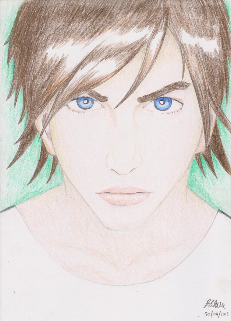
Well, I don't wanna give much away, that's the reason I hadn't said a thing about the character's personalities or names. No harm in showing them though! i45.tinypic.com/24gljeo.jpgPs: I enchanced the style a little(look at the eyes). |
|
|
|
Post by polistiren on Aug 22, 2012 2:00:11 GMT -5
Ok, so: 1) I just gave Tim (what I belive to be) a more inspired redesign; 2) The webcomic will be full coloror, since the screentones look too static and artificial; Now, I'll upload the color version of this tommorow: i49.tinypic.com/33lfa5c.jpg |
|
|
|
Post by polistiren on Aug 23, 2012 13:16:10 GMT -5
|
|
|
|
Post by polistiren on Sept 2, 2012 14:05:02 GMT -5
Ok, I figured I need to do a few pages to get used to work full color(among other things). So I am doing a 2 page oneshot that takes place in the same universe at an unspecified time. I am also moving this thread to art talk, since I am in need of feedback at this point(already sended the request). Without further ado, here's the first page(I should be finishing the secound one by the end of the week): i49.tinypic.com/29z4z6q.jpg Looking foward to your criticism. ;D |
|
|
|
Post by leucome on Sept 4, 2012 15:14:21 GMT -5
I like your story concept .  Your character propartion are quite good but i think there are someting to work about 3/4 view shoulder. |
|
|
|
Post by polistiren on Sept 4, 2012 17:03:35 GMT -5
Oh, that one. You mean the secound panel, right?
I waned to have a low-angle perspective, to empower him.
The body is done ok, but the head is drawn off-perspective.
|
|
|
|
Post by polistiren on Sept 6, 2012 14:51:48 GMT -5
Ok, so I'm out of acrylics till next week(financiar issues). So I'll post what I've done so far on the secound page, and some ships and building designs in the days that follows(since those are important too). Now, in the first page, I tried to make the lines less static and motionsless by using no ruler. That didn't work out that great, so I got back to using the ruler. Also before coloring I decided to add hatches so the art gets a more 'complete' look. i47.tinypic.com/nbvfnp.jpg Also, as tehnical info, the series will have 3 Acts. Each act will have aprox. 16 chapter. And each chapter will have 18 to 35 pages. So that amounts to 864 to 1680 pages. Interesting... |
|
|
|
Post by leucome on Sept 7, 2012 0:39:14 GMT -5
Better with a ruler .. |
|
|
|
Post by polistiren on Sept 11, 2012 14:01:00 GMT -5
Got my acrylics earlier. Yay! And finaly got the hang of adult faces(sorta). Plus, a better color palette nad overall enhanced art. i50.tinypic.com/8zmomw.jpg Ps: Looks pixelated, I know. I have to turn the resolution down for this forum. Looks more sharper in higher resolutions. |
|
|
|
Post by leucome on Sept 11, 2012 20:53:28 GMT -5
Good job:) It's acrylic paint? Maybe you can lower your jpeg compression. The file take alot of place for the size. And you can save an other 20k by converting it with fastone or some other tool or delete metadata. Photoshop add almost 30k of metadata not realy useful if you don't use it. Yuur file is about the normal size in pixel for a web comic. So maybe just add a little sharpen effect before scaling it down and and use "bicubic filter (for reduction)". And set jpeg quality little bit lower just for faster loading . Note my photoshop is in french so i am not sure for translation of the filter , So i made one test.. and i exagerated a bit the compression is to low and file too large but weight less than 1024K It's 1914x2698 Pixel at 5 jpeg quality on fastone .. ( i used rgb so it's as big as color pic even if it's not) Attachments:
|
|
|
|
Post by leucome on Sept 11, 2012 21:24:14 GMT -5
Just a test. Changed level and added sharpen effect. Sory not really improved alot But It's an idea . I tested jpeg quality at 9(on photoshop) file size is almost the alf and we can not see any jpeg artifact . Note: jpg 9 (photoshop) each soft have is own rule for the quality number. Attachments:
|
|
|
|
Post by polistiren on Sept 12, 2012 1:17:28 GMT -5
Thanks! That's extremly helpuful, not only for the quality, but also for the image upload sites, since the pic had about 37 MB. It's a little higher resolution, tough I think that can be fixed with a lower quality. Gotta check all of them out to see witch is best. i48.tinypic.com/r8xt1h.jpg Ps: the quality should be, at least in my case, just bellow 9, to keep the size at 10 MB or less, otherwise it's too big to upload. |
|
|
|
Post by kokoroinc on Sept 12, 2012 22:01:40 GMT -5
Tell me about how you use acrylic paint? I use watercolors of which I'm pretty happy with, but I have a bunch of acrylic tubes I don't use.
|
|
Shadow Major
Deliverer
 Current project: The Realm Wanderer
Posts: 234
|
Post by Shadow Major on Sept 13, 2012 1:37:01 GMT -5
Just thought I'd jump in here (if you don't mind!) to quickly explain that before I got my watercolours, I used to use acrylics as a substitute. I just used them the same way as you do with watercolour - add a bit of water and just start painting. It seemed to work for me.
|
|
|
|
Post by polistiren on Sept 13, 2012 1:37:07 GMT -5
Huh? Aren't watercolors the same with acrylics. Let me check this... Ok, I got this. Watercolor is a technique of painting(transparent, no brushstrokes). There are indeed materials specificaly made for watercolor painting, but they're basically solidified acrylics in water. In art, there is either acrylic painting or oil painting.
As technique, I don't see much of a difference(aside from 'watercolors have more water'). The watercolors are more transparent, while acrylics leave more of a 'solid' estetic.
As for general technique(on both mediums), well, let me see:
Use only 3(maybe 4) colors and the 2 noncolors(black and white). The colors are yellow(includes ocher),red(includes orange and brown) or blue(includes green). Those are 'primary colors'.
Other colors you get by combining the three. And that, you should do all the time. If you're using colors directly from the tubes onto the paper, then you're not painting, you're dyeing.
Experiment with shades, see what you can come up with(for instance, I found the skin tone, by combining carmine red, golden yellow, then use white to light up the color, and voilà).
Don't limit yourself to one layer of paint. I always have at least 2 on each object(or person, building, whatever).
Avoid monochromy.
Warm colors(yellow, orange, red) contrast cold ones(violet, blue, green). Use that contrast for a more appealing estetic. But don't forget that not all color get along(google 'color wheel', the colors witch are opposant are the ones that don't match; yellow with violet, orange with blue and red with green).
That's about all I know. If I missed something I'll come back to this post.
Later edit: Ok, I'm an idiot. Watercolors is its own thing, not a variant of acrylics. But don't blame me! It's wikipedia's fault!
|
|
|
|
Post by leucome on Sept 13, 2012 3:14:41 GMT -5
Ho your new upload look really good . We can see all the subtle details in your paint with really crisp ink |
|
|
|
Post by polistiren on Sept 13, 2012 18:06:56 GMT -5
That's thanks to you! Btw, just looked again at the page you posted; awesome stuff there. Great use of tones, VERY atmospheric.
|
|
|
|
Post by polistiren on Sept 16, 2012 7:16:44 GMT -5
3rd redesign of Tim. The previous one gave him to much of an aviator look. I plan to add to it jacket or something similar, though this will bee his casual look. Also, what I said about Tim's background doesn't make things clear enough. So, here a paragraph from the seting encyclopedia(if you write a fictional world, do it properly!): " LEADERSHIP In order to avoid power abuse, the state is dividet betwen nobles of various influence. They chose everything by vote, from a restructuration of a company on public domain to declaring war to neighbouring countries. The goverment is dictatorial, as there is no public vote, everything being solved by the nobles." i46.tinypic.com/mm8pyv.jpg Ps: Unlike the previous ones, this one's inked with a pen. Gives a better effect, though I gotta get used to using it. |
|
|
|
Post by polistiren on Sept 17, 2012 14:17:41 GMT -5
Another design. This time, it's a girl. i49.tinypic.com/swtiip.jpg My next duty(aside from coloring this drawing): learn to draw arms! Anything else not looking right here? |
|
|
|
Post by kokoroinc on Sept 17, 2012 22:25:55 GMT -5
So the coloring was done with acrylic paints being used like watercolors? Maybe I can use the two mediums, because watercolors are good for coloring a large space but tend to be very transparent and need multiple layers. I would like sharper colors like the art above. Am I getting this right? When I used to be a painter and use acrylics, I would straight paint onto acrylic surfaces, such as canvas without any water. I never thought you could use acrylics with water.
|
|
Shadow Major
Deliverer
Current project: The Realm Wanderer
Posts: 234
|
Post by Shadow Major on Sept 17, 2012 23:28:14 GMT -5
So the coloring was done with acrylic paints being used like watercolors? Maybe I can use the two mediums, because watercolors are good for coloring a large space but tend to be very transparent and need multiple layers. I would like sharper colors like the art above. Am I getting this right? When I used to be a painter and use acrylics, I would straight paint onto acrylic surfaces, such as canvas without any water. I never thought you could use acrylics with water. Yep, it's possible. Acrylic is water-based. Some of my work on my DeviantArt was done with acrylics and water before I actually got my watercolours. In fact, I still use a flesh-coloured acrylic paint for my character's skin tones. I don't really see much difference between watercolour and acrylic, except, as you said, acrylic offers sharper tones, unlike watercolour which is very transparent. I feel that watercolour is easier to spread across the page than acrylic however. |
|
|
|
Post by polistiren on Sept 18, 2012 9:57:55 GMT -5
I don't think I phrased that comment right. I used acrylics(with water) until the first page, but then switched to what you call watercolor(its own thing if you really want). The difference is right there to see.
|
|
|
|
Post by polistiren on Sept 21, 2012 13:39:05 GMT -5
Meh, redrew her from scratch. Head too big, arms and shoulders not right looking... Now hopefully this looks better. And since I have a few character designs done, I'm gonna start doing the character sheets(gotta keep the look consistent from panel to panel, look at the 2 page oneshot I posted above for the 'what happens if' scenario). i45.tinypic.com/plqpk.jpg |
|
|
|
Post by leucome on Sept 22, 2012 21:55:01 GMT -5
|
|
|
|
Post by polistiren on Sept 23, 2012 1:01:48 GMT -5
Thanks! Didn't know about the center of gravity. Amoung other small details.
|
|
|
|
Post by polistiren on Sept 26, 2012 11:12:39 GMT -5
|
|
|
|
Post by polistiren on Sept 26, 2012 11:57:46 GMT -5
|
|
|
|
Post by polistiren on Sept 27, 2012 12:15:12 GMT -5
Ok, moved back to acrylics. With watercolors the colors(that sounded horrible) felt to much like something in the background. Ah, one day, I'll do proper anathomy... i50.tinypic.com/2d85gtu.jpg |
|